DODD CREATIVE
SUPPLY
branding
As an art director with the Layton Design Studio at the University of Georgia, I collaborated with a team of designers to conceptualize, develop, and execute a brand identity toolkit for an art supplies store inside the Lamar Dodd School of Art.
Overview
primary logo
secondary logo
brandmark
Dodd Creative Supply is a retail space that serves the artistic and educational community of the Lamar Dodd School of Art. It is a vital part of the school, supporting students by providing access to art supplies and the tools needed to create. As part of its mission, it also gives grants to sustain the arts. When you shop at DCS, you support artists tomorrow.
Our team facilitated client meetings to define the problem and scope of the project. We initiated collaborative workshops to create three unique and relevant brand concepts. Our process included mind mapping, curating visual research, and developing three directions for the brand’s name, personality, and visual identity.
process
Based on our research, we developed a concept that incorporates contemporary design and Risograph printing—a resource the client uses daily. This concept encapsulates a bold, modular approach that mirrors the dynamic nature of the arts and is flexible to change. Utilizing collage and RISO printing, this approach reflects creativity, adaptability, and the dynamic energy of the art school creating space for new possibilities.
process
primary color palette
After we conducted our naming workshops as a team, we landed on five potential names for the retail space: Dodd Creative Supply, the c(art), Dodds & Ends, Junk Drawer, and Color Wheel. Each of these name options touched on specific aspects of what makes this store special.
The name Dodd Creative Supply was chosen for its familiar while professional tone. This name is straightforward yet has a creative edge, and “Creative Supply” keeps it open ended for potential store expansion. From there, we created a color system that reflects the colors available through the Risograph printer.
secondary color palette
Our creative decisions were driven by our client’s limited resources and access to software, ensuring accessible implementation of the brand’s identity.
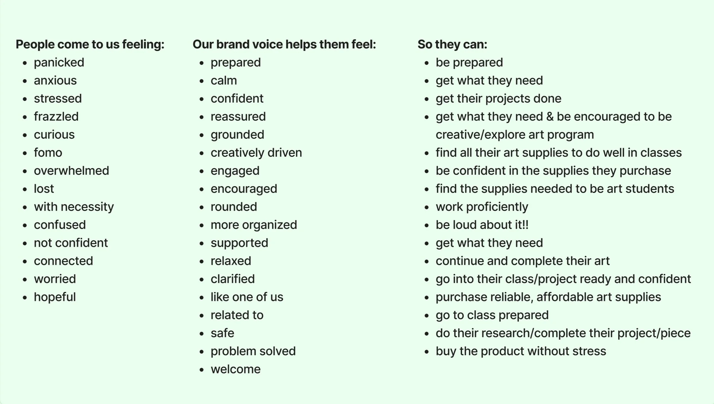
As members of our team, we all put on multiple hats to complete this project. My roles included facilitating a naming and brand tone workshop, where we worked together as a group to understand Dodd Creative Supply and lock in a brand voice and personality. I was also responsible for the creation and refinement of one of our Dodds & Ends logo concepts, which was another name option that we created. When presenting to clients, each presentation was split into sections, and each section was assigned a speaker and a scribe. Multiple presentations allowed us to try new roles each time.
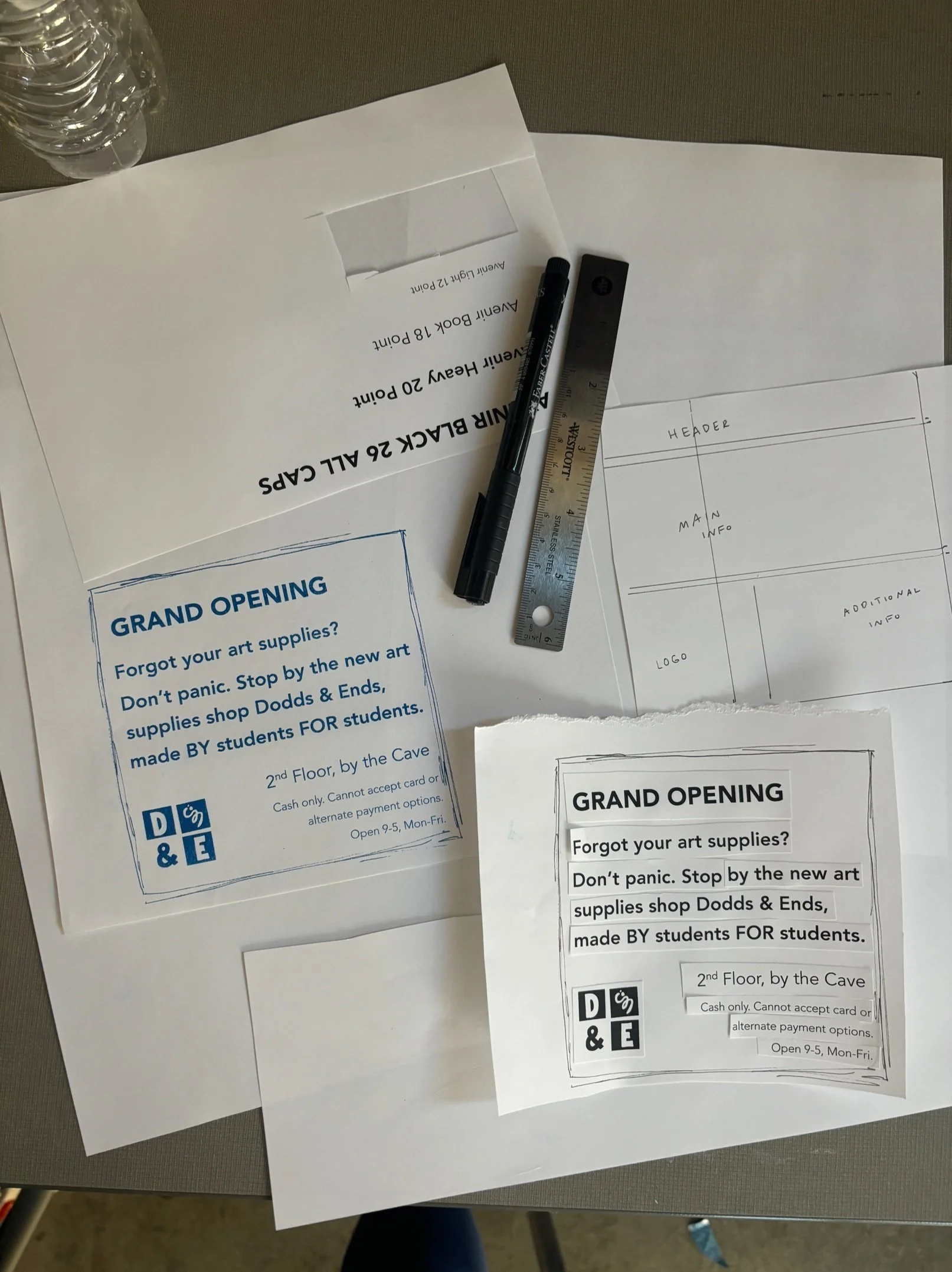
We made a template system for social media posts and fliers where the client can place logos and text to create promotional material. We also showed different brand touchpoints that are important to the Dodd Creative Supply brand. Ultimately, our final deliverable manifested in the form of a comprehensive brand toolkit that sets up the client to successfully apply the brand after it leaves our hands.
dynamic Dodds & Ends logo


